
What happens between the first email and the final illustration?
No two editorial gigs are the same, but it usually goes something like: get the brief, toss around ideas, sketch, then finish up the artwork.
Here’s a peek at how it went for Kitchen Table Magazine, from first layout to the final illustrations.
The project: Kitchen Table Magazine, Issue 7
For The Baked Issue (Issue 7) of Kitchen Table Magazine, I worked with creative director and designer Katrina Clasen on a two-page spread for "Menu," a piece written by Miriam Garcia.
Katrina sent over the article and a rough layout with spots marked for the illustrations. One big illustration (about a third of a page) and five smaller ones scattered around.
Having both the text and the layout from the beginning was especially useful. It gave me a clear idea of the available space and how the illustrations would work alongside the writing.
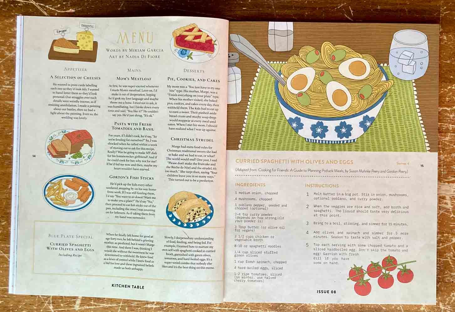
The finished double-page spread in Kitchen Table Magazine, Issue 8 (The Baked Issue). My illustrations accompany “Menu,” a piece written by Miriam Garcia and designed by creative director Katrina Clasen.
Finding the illustrations in the text
Before drawing anything, I read the article carefully to identify which details would translate well into images.
For the larger illustration on the second page, I chose a recipe mentioned in the text: curried spaghetti with olives and eggs.
Since this part of the article explored eating alone after divorce, I wanted the illustration to suggest a meal for one. I placed a bowl of spaghetti on a wooden table with a placemat, a glass of sparkling water, and salt-and-pepper shakers. Nothing elaborate, just a table set for one person.
For the smaller spot on that page, I illustrated cherry tomatoes, another ingredient from the recipe.
On the first page, I selected five different dishes mentioned throughout the article. Rather than drawing them all on identical plates, I varied the tableware patterns. This gave each dish its own character while suggesting different meals and the passage of time.
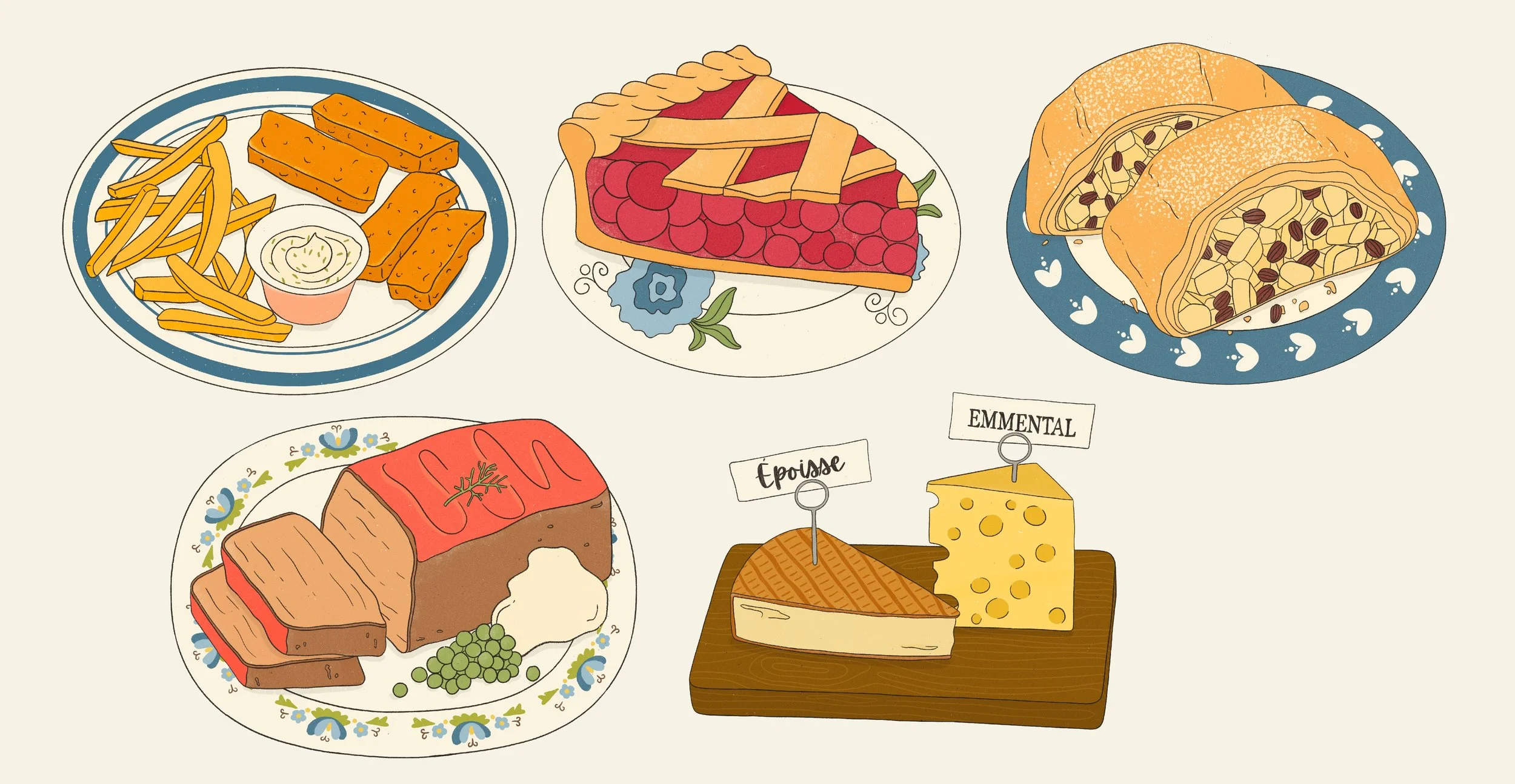
The five finished spot illustrations feature dishes selected from the text. I varied the plate patterns and colour combinations to give each illustration its own character and suggest the passage of time.
Working directly in the layout
For this project, I made my initial sketches in Procreate, drawing in blue directly over a copy of the magazine layout.
This allowed me to see how the illustrations would fit into the spread from the start, rather than developing them separately and trying to make them work afterward.
It also made the sketches easier to review. Katrina could see the proposed compositions, their scale and how they interacted with the text.
I sent the first sketches on January 8. They were approved without any changes.
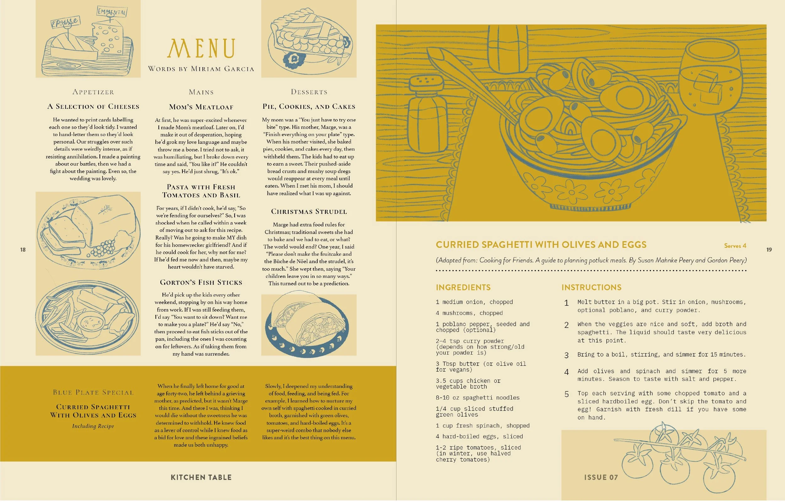
Initial sketches, drawn in blue directly over the proposed double-page layout in Procreate. Working within the layout allowed me to check the placement, scale and balance of each illustration alongside the text.
From sketches to colour
Once the sketches were approved, I moved on to the final illustrations, also created in Procreate.
This stage is where I developed the colours, refined the linework and added the details that bring the individual illustrations together.
I sent the coloured artwork for review on January 21 and received approval that same day.
Not every project goes through the process without revisions. That's why the sketch stage matters: it's an opportunity to make sure the composition and overall direction are working before moving on to the finished artwork.
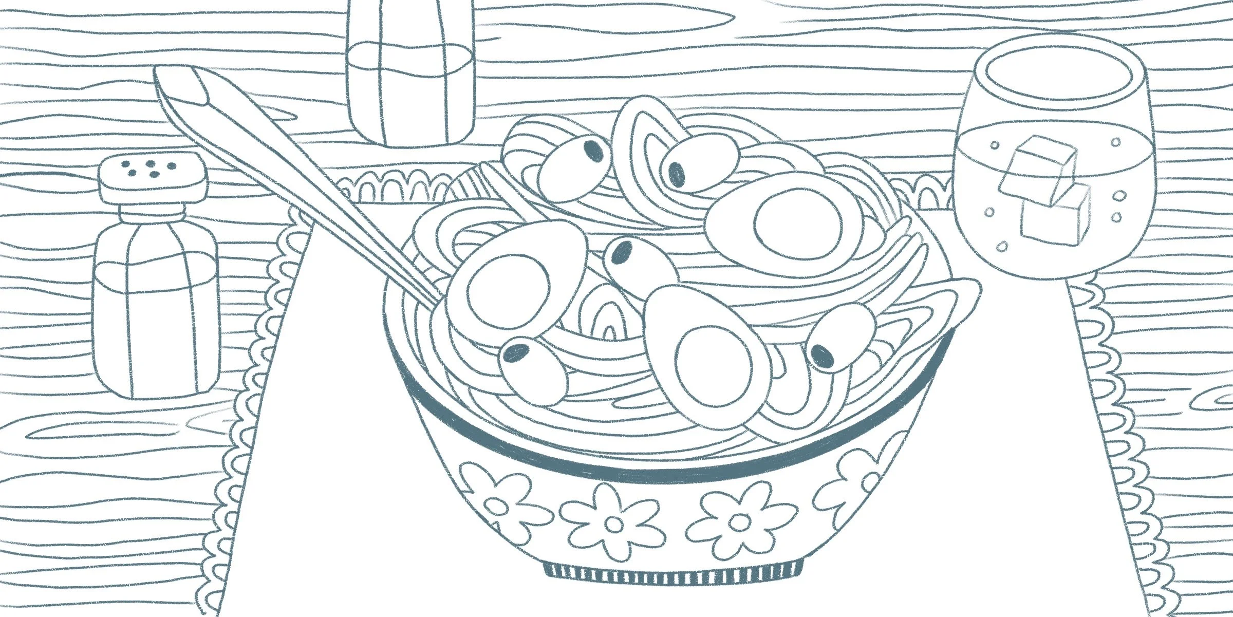
The initial sketch for the larger illustration, featuring curried spaghetti with olives and eggs. I set the scene with a patterned bowl, a placemat, sparkling water, and salt and pepper shakers to suggest a simple meal for one.
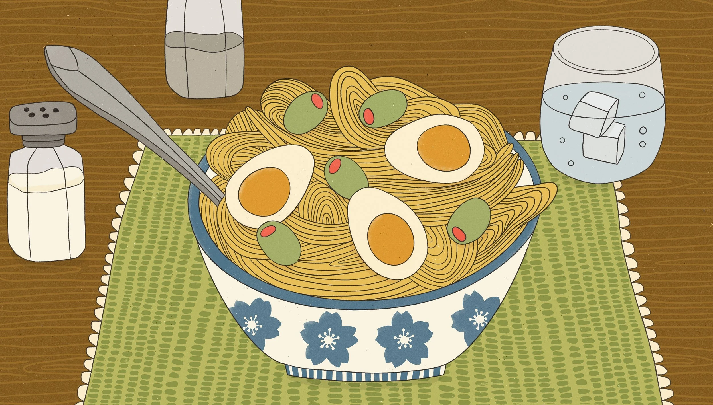
The finished illustration of curried spaghetti with olives and eggs. I used warm colours, patterned tableware and a simple table setting to capture the idea of a meal for one.
Preparing the final artwork
Once everything was approved, I prepared the clean, high-resolution files for publication.
I work digitally in raster format, and I prepare the final files according to the project's requirements. For this assignment, that meant 300 dpi artwork, with transparent PNGs for most of the illustrations and high-quality TIFFs for pieces with full backgrounds.
Depending on the assignment, I can also provide JPG, PSD or PDF files.
I delivered the final artwork via Dropbox later that day, a full week ahead of the deadline.
We discussed the project before the holidays, and I let Katrina know in advance that I would be taking two weeks off. Planning around that time away allowed the work to move forward without affecting the publication schedule.
Thinking about commissioning an illustration?
Whether you're working on a magazine feature, a cookbook or another publishing project, a clear brief is a useful starting point.
You don't necessarily need to have every visual detail figured out. A manuscript or draft text, an idea of where the illustrations will appear, approximate dimensions, and a deadline are often enough to start a conversation.
From there, we can discuss the illustrations, the scope of the project and what you'll need for the final files.